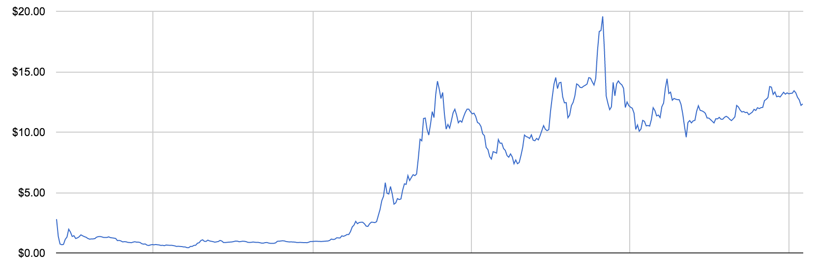
The Shitcoin Pattern
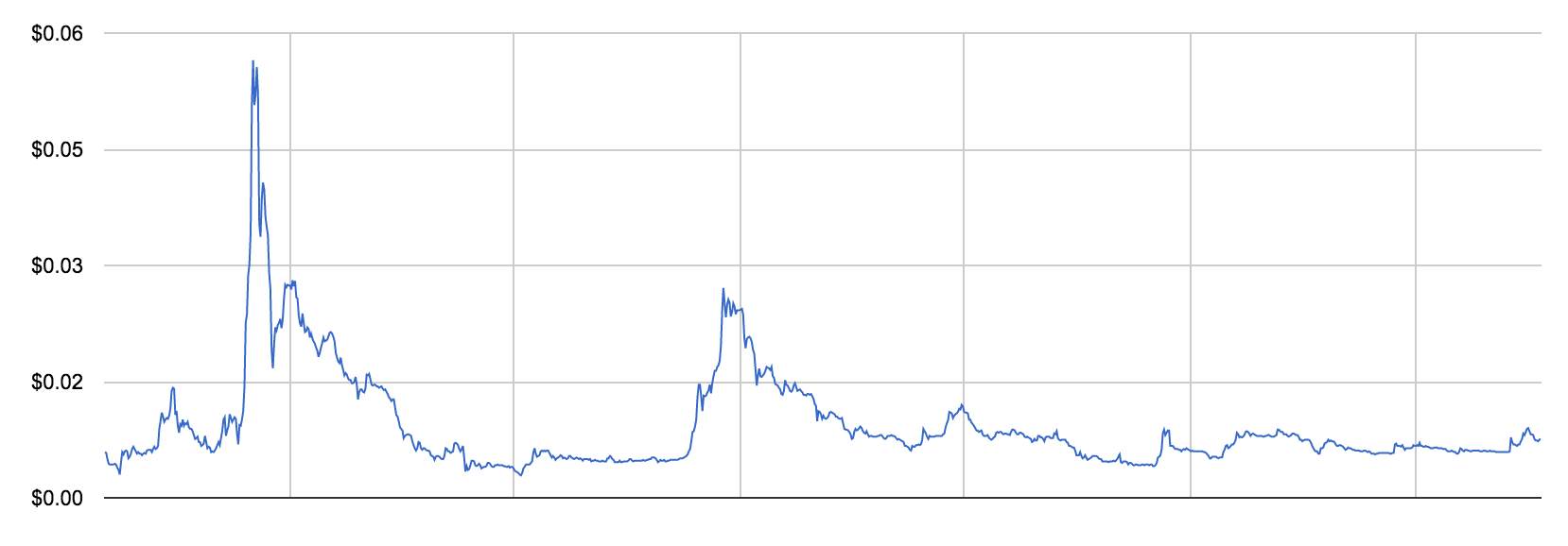
Seen this price pattern? Yes? Here’s another one…

The first graph is XRP/Ripple, while the second one LTC/Litecoin. But really it could have been any altcoin through to 2014 so you should be familiar with it.
It’s what I call the “Shitcoin Pattern”.
Prior to 2015, nearly all altcoins exhibited this pattern, a peak, followed by a long and gradual decay to shit-dom. Not even the high profile coins like Ripple and Litecoin have been immune.
But by 2015 this started changing, we saw a few break into new all-time-highs in successive waves, to create charts looking more like Bitcoin’s successively bigger pump and decays.
In altcoin land, for the HODLers, I suggest looking for coins that have broken the shitcoin pattern. Always look for at least one cycle that goes bigger than the last, treat that as a buy signal.
Ethereum was one of the first more notable coins to break the shitcoin cycle.
Around the same year we saw a whole wave of others, notably MAID and DASH, break the pattern.
Finally I’ll leave you with NAV which demonstrates nearly a picture perfect increasing wave cycle, this is the pattern you are looking for, but it could be better if each wave had more time between cycles. (By the way, I’m not saying buy NAV, I’m saying it happens to have the right shape).
