Why does on-chain volume show an overly bearish picture of the 2018-2019 Bitcoin market?
Let's delve into a mystery of this 2018-2019 bear market that David Puell and Murad Mahmudov and I have been exploring for months... Why does on-chain volume look so bearish while many of our other (to be published) metrics tell a more positive story?
Up to now, whenever you saw a chart of mine that had on-chain volume as an ingredient, the volume estimates came from Blockchain.com's API feed (BCHAIN). This was the first and most reliable source until recently.
The Bitcoin Network needs sufficient on-chain volume in order to fuel a bull market. BCHAIN volume estimates painted a very grim picture of the market, it was saying "lots more bear to come".
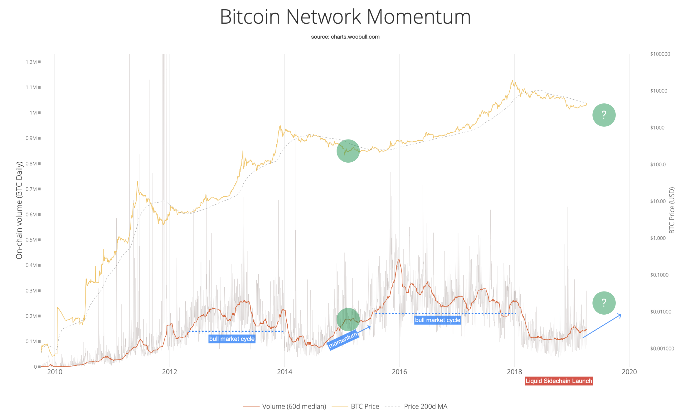
If we wanted to double check BCHAIN volume estimates, how could we do this?
When you think about it, coins that are younger than 1 day of HODL means they have shifted in the last 24hrs. This gives us an alternative estimate to 24hr on-chain volume.
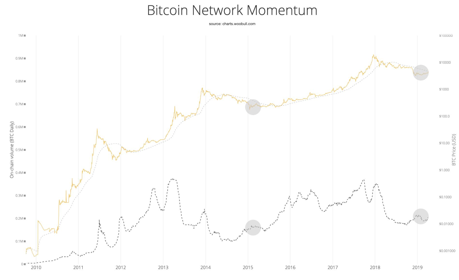
When I did this**, it suggested a drift in the BCHAIN volume estimates since 2017 to the low side. This would point towards an overly bearish picture from BCHAIN.
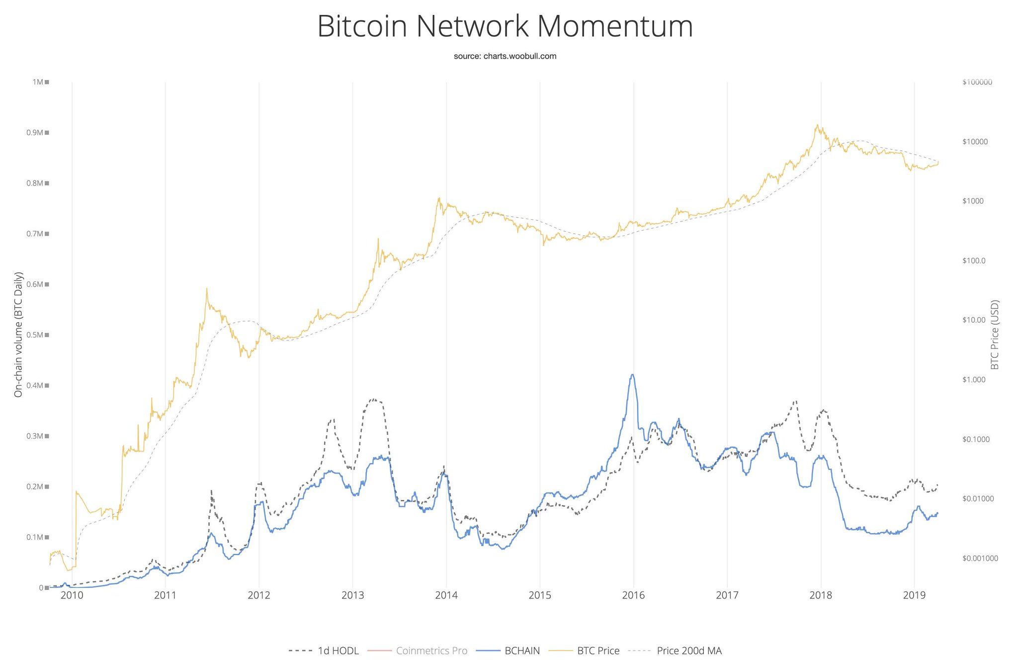
In fact, 1d HODL "volume" pointed to the bottom being in for quite some time. The accumulation band having already formed.
Fortunately we now have a completely new on-chain volume estimate from Coinmetrics, currently available in their CM Pro suite***.
Here's how they stack up...
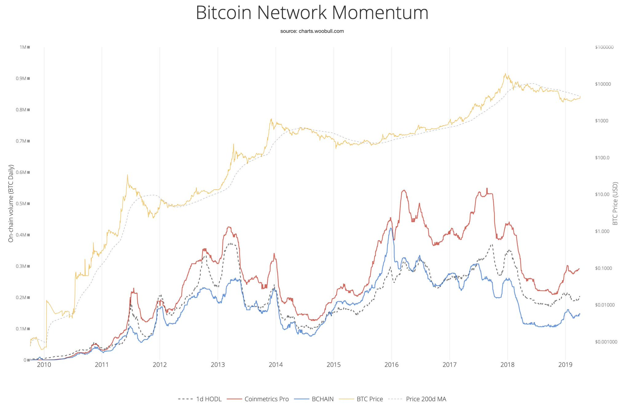
Both my 1 day HODL, and the new CM Pro volume estimates suggests the accumulation bottom is now well under way.
** 1-day HODL coin volume is derived by multiplying Unchain Capital's 1d HODL Wave chart with the circulating supply of Bitcoin.
*** CM Pro volume estimates are published under permission from Coinmetrics.